I just want to cover the very, very basic theory of color temperature / white balance here. I feel like even just the most cursory look would have helped me a lot when I was first trying to figure out what the heck temperature meant in terms of light! It is a pretty unintuitive idea until you really start thinking about it and looking at the physics.

Temperature is confusing!
Why is it so unintuitive? Because we tend to think of cool as bluer (aesthetically / artistically cool) and red as hotter (aesthetically / artistically hot), whereas color temperature is a purely physical property that actually works in the opposite way.
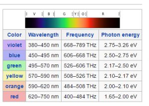
Physically speaking, if we take a look at the visible light spectrum, we perceive light in the range of frequencies of 430–770 THz. Higher frequencies have more energy and lower frequencies have less energy. Blue is higher frequency / higher energy and red is lower frequency / lower energy.
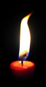
 This is perhaps more intuitive if we take a look at a candle flame. You probably already know that the hottest part of the flame (at the base near the burn zone and the edges of the flame shape) appears blue. As we move away from this zone, the flame becomes more yellow, orange, and finally, red at the least hot points. So, we can see from the flame that the hottest temperatures generate the bluest light.
It is important to carefully understand that people may use hot and cool in a way that inverts the true heat and color temperature system that our cameras use. In art, blue is a cooler color, but physically, blue is a hotter temperature. Our cameras work in the physical domain.
Once you’ve got that down, it’s much easier to think through temperature balancing (often just called white balancing, though there can be distinctions).
What does the camera do and what does the camera not do?
The other potentially confusing point with temperature selection in the camera is that we are not selecting the temperature that we want, but rather the temperature that the camera should assume that the image actually is. We want to set the camera so that it sees the same thing our eyes see.
If you were to take a piece of white paper and look at it in a low-light room, it would look white to you. If you took that same piece of paper outside on a sunny day, it would look almost the same color to you. The physical light reflecting off that paper to your visual system in those two scenarios is vastly different, but our visual system is very, very adaptive to our setting, and we essentially “auto white balance.” We correct for differences in physical light temperature and perceive those differences as much smaller than they physically are.
While our eyes balance based on the type of light in our physical space, they do not perform the same feat while examining an image taken with a camera.
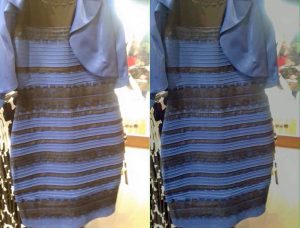
There was that very famous recent meme about the dress that was either white and gold or blue and black. This was an optical illusion that took advantage of a methodology for confusing our white balance system. How you perceive the dress depends on the context that your visual system chooses to white balance for. Camera settings can make color perceptions change in the same way.
How do you set the temperature?
If we want the camera to see what our eyes see, we need to set the camera temperature to match the image temperature and neutralize the colors the same way our eyes do when we look at that piece of paper in sunlight or low light.
Method: In the temperature or white balance camera setup menu, pick the temperature that matches the value of your light source.
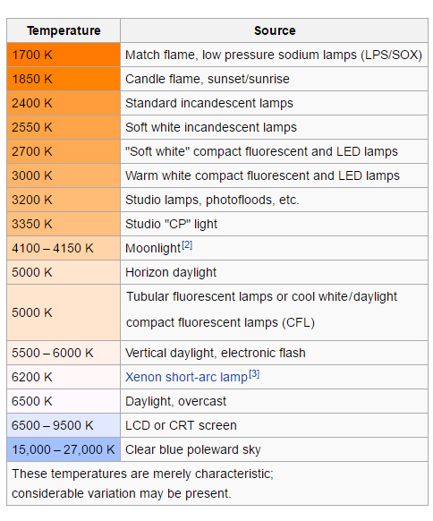
Rough light source temperatures are listed in the chart on the left. These can vary based on many factors, and often, there are mixed sources with different temperatures, which can be tricky. You will need to use your eyes to decide many times!
What happens if you don’t set the camera to the same temperature as your light source(s)? Your camera fails to compensate for the way your sources cast light and you end up with coloring that is the opposite of your camera temperature setting:
- If you set your temperature lower than the light source temperature, the camera will assume the light source is redder and will try and correct by reducing the redness of the image, which results in a bluer image.
- If you set your temperature higher than the light source temperature, the camera will assume the light source is bluer and will try and correct by reducing the blueness of the image, which results in a redder image.
Tip: One of the solutions for mixing lighting types is to look for ways to match light sources. We try and use LED light panels that generate 5500K light, which blends pretty well with general daylight. (Matching actual sunlight leaking into a room, however, is VERY difficult.)
Sample color temperature settings
Here is an example image that I shot in RAW (so I could adjust the temperature setting on the camera in post) on a Canon 5Dmkii. The first image is the original that I shot at 5500K (which is what the camera’s auto white balance selected). For each of the subsequent images, I loaded the RAW file and adjusted the temperature to recreate a scenario in which I had shot this image using that temperature setting on the camera. Low temperature settings will result in a blue image, high temperature settings will result in a red image (again, the opposite of the temperature scale because the camera is compensating for an expected color based on temperature).
I chose this image because of the mix of colors present. You may even find that you prefer a color temperature setting different from 5500K. There is no “right” temperature. There is just setting the temperature correctly to achieve the look you want.
The following slideshow ranges from 2,000K to 50,000K
[2jslideshow id=”317″]
If you’d like to read more on white balancing, I think the guide below is really excellent and gets into some additional detail that I have not covered here.